Color contrast prototype
Using AI to help people pair accessible design tokens.
Challenge
While helping product teams adopt a new design token system, they needed a way to better know which tokens were accessible together.
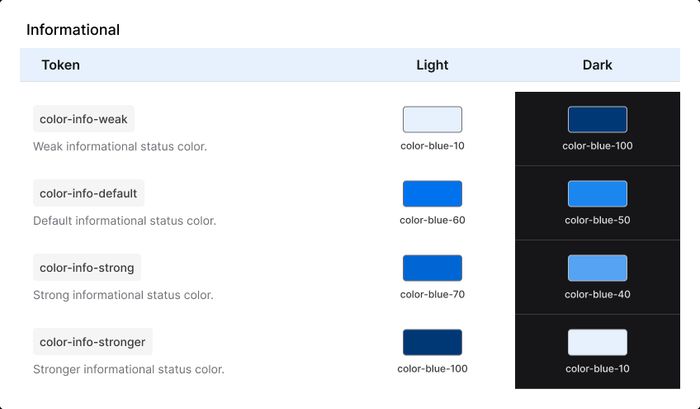
When applying semantic tokens, like color-text-default on color-background-default, the color contrast was already accounted for. But to initially adopt tokens in projects, some teams would need to rely on the more generic base tokens, like color-blue-70.
Pairing core and semantic colors isn’t ideal, as it foregoes long-term benefits that can result in inconsistencies and bugs. But getting everyone using the same system is half the battle, so we needed to offer flexible adoption that people could also implement accurately.
There’s no shortage of contrast calculators on the web, but we wanted one that:
- users could choose from a list of colors (instead of manually entering hex codes with tools like WhoCanUse)
- displayed colors by their token names rather than color value
- people could use within the design system doc site
- didn’t require significant effort, as we intended to incorporate the updated contrast scoring from WCAG 3
How I helped
I timeboxed an afternoon to explore how we might offer proactive contrast guidance for the color tokens in the system.
Using Claude, I vibe coded a proof of concept that uses JavaScript to calculate the contrast between 2 color tokens, based on WCAG 2 formula. It shows the contrast ratio and indicates whether it passes WCAG 2.1 AA.
It filled the short-term need, and using a LLM to create something interactive was much quicker than Figma. Once a dev cleaned up the code, we had an efficient solution on the doc site for anyone in the org to use.
Demo
Color contrast tool
This is large text (24px)
This is standard text (19px)
Standard text counts as "large" if bolded
