Redesigning component guidelines
Scalable docs to help people use the design system more effectively.
Overview
Challenge
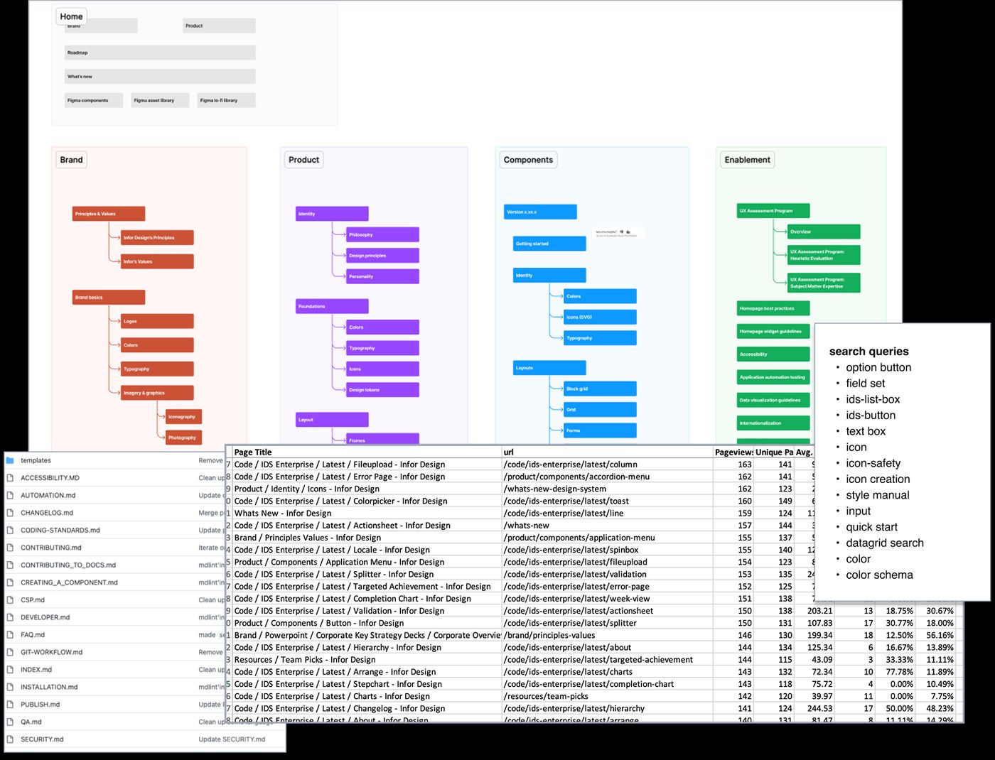
The design system had evolved over time to support over 110 components across 3 code frameworks.
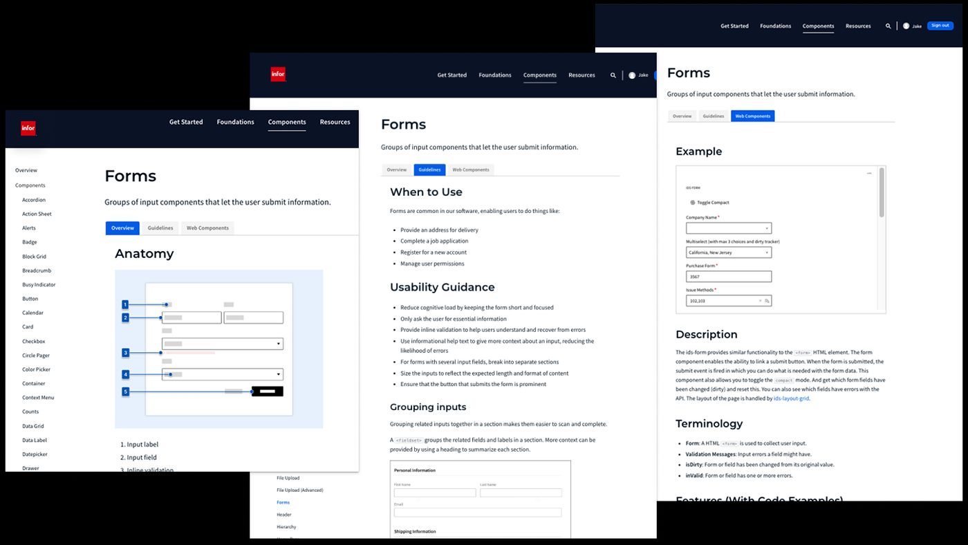
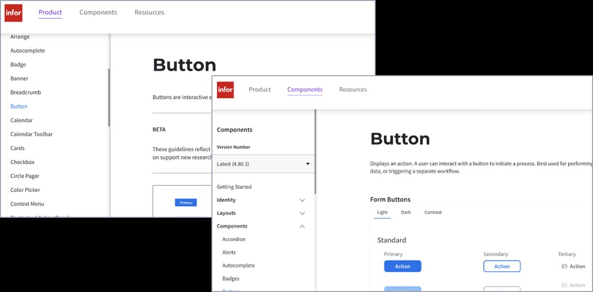
There was a set of pages maintained by developersut each component provided information in different structures.
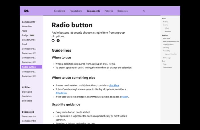
Structure
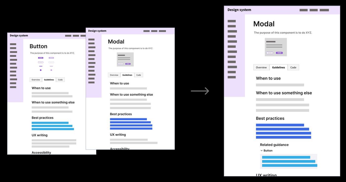
Each component was documented in two separate places within the design system site: one contained implementation details that reflected current and the other provided more aspirational design guidance.
Siloed guidance meant that designers and developers more often only paid attention to “their” sections. leading to and code was antithetical to a design system.
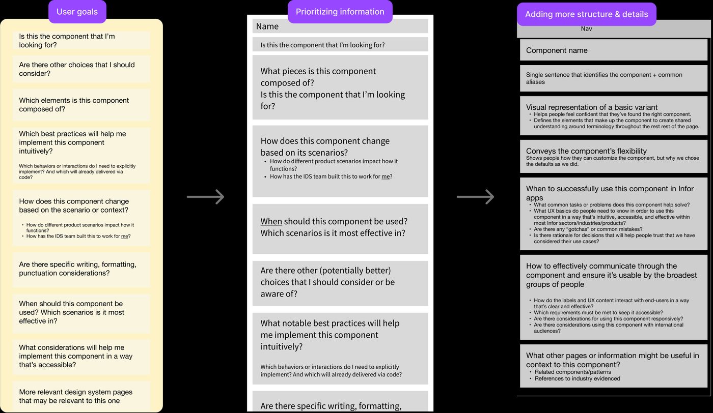
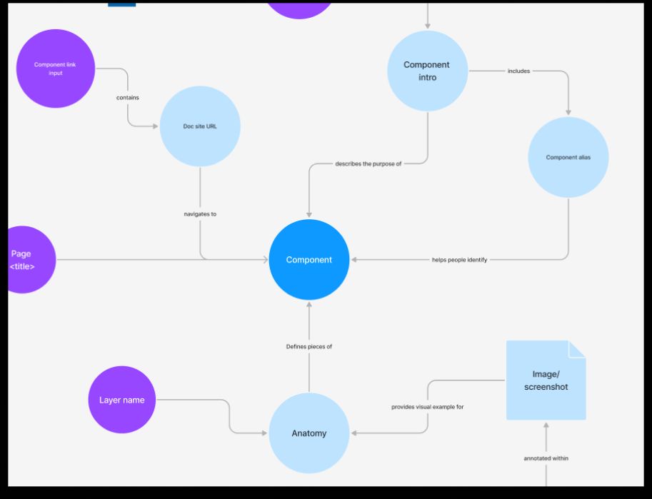
Information architecture
Components used inconsistent page structures, as some types of information were more relevant for some types of elements.
How I helped
Actionable, readable, intentional
Scalable and modular
Meet people where they are
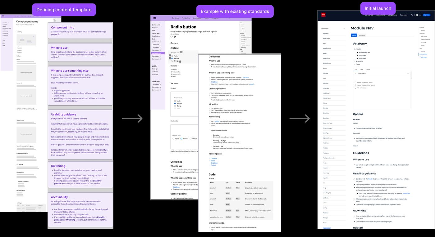
More examples
Click to expand.
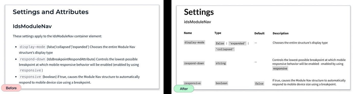
I worked with devs to improve readability for component API props by getting the output into a more scannable format.
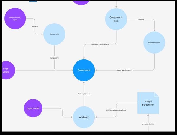
Mapping the system assets gave more visibility into how data was related across the doc site, Figma, and GitHub.
