UX writing samples
Bringing clarity to product microcopy.
Guiding users to success
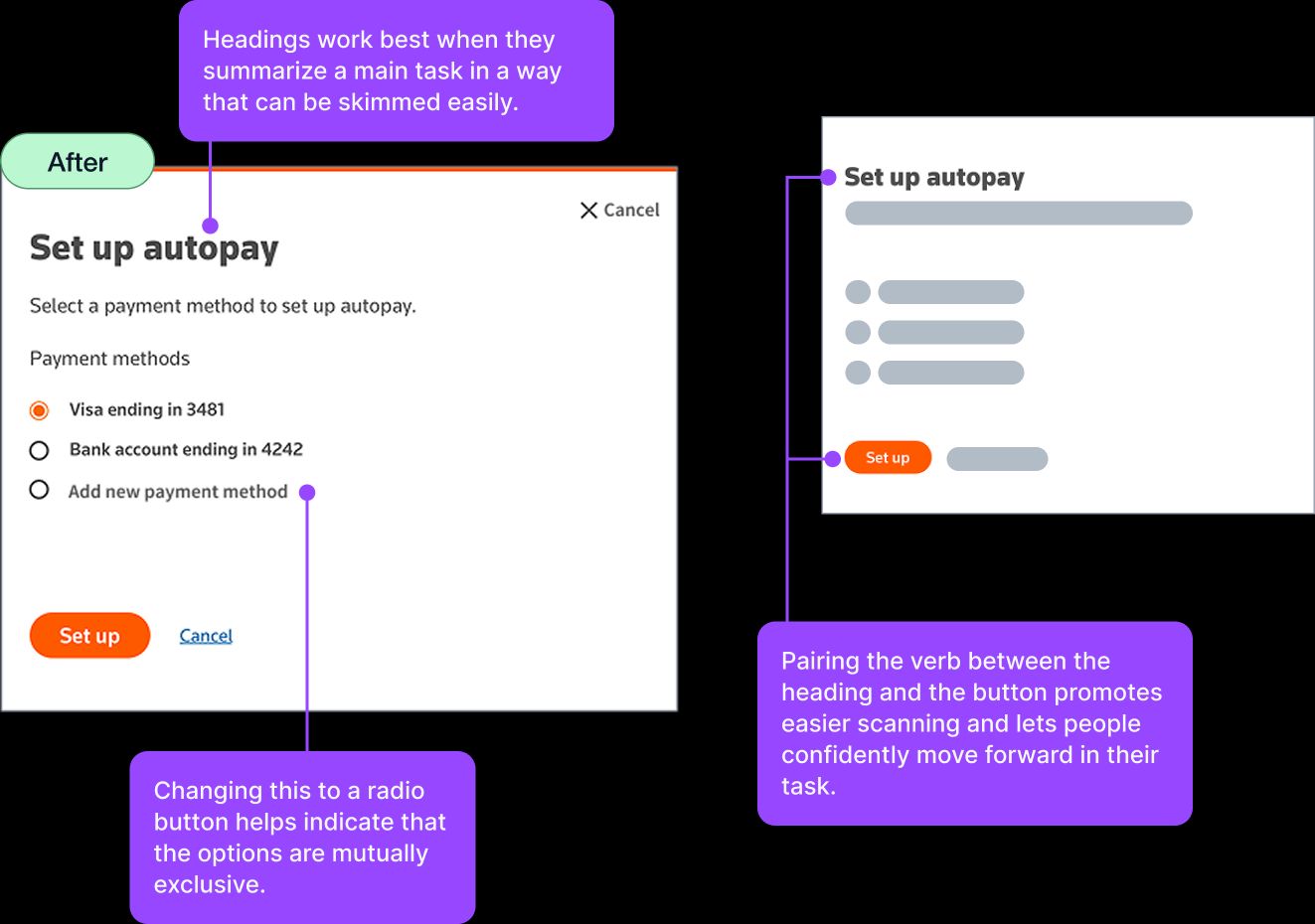
While working on a billing feature for customers to manage payments for their company’s accounts, my product designer came to me with an initial design draft:
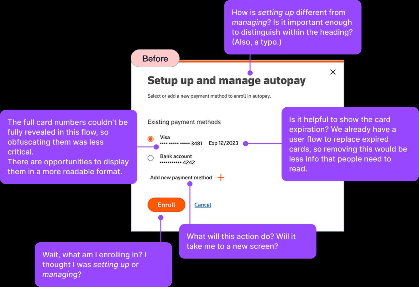
It’s a good example of why I like to chat about the flow before design and content get too far into the weeds. There was some basic style to adjust, but I also had questions that impacted the user flow. Once I provided feedback and suggestions —like converting “Add new payment” to a radio button— we were able to find a simpler design.
Considering assistive technology
I typically avoid using characters and symbols like asterisks whenever possible, as assistive technology is pretty inconsistent in how it relays them to users. While the 3 most popular screen readers finally all pronounce * as “star,” other symbols are still inconsistently supported and much is dependent on individual device settings.
For example, conveying a range like May - November would be pronounced as “May dash November.” Instead, using May to November uses an extra character but ensures clarity for all users.
Writing for constraints
UX copy can’t save bad design, but at times it can help manage expectations.
In a workflow tool where users convert annotated documents into custom reports, the project team identified an edge case. If users had many (as in, hundreds of) nested folders, it would impact performance and would take longer to generate the report.
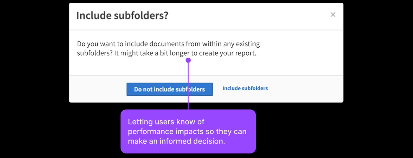
It intentionally breaks the pattern from the previous example of aligning the modal heading and the action. I’m usually conscious about not second guessing the user’s choices, but in this case created just enough friction for them to hesitate and read the full message.
I always enjoy working on these less common scenarios that weren’t initially designed for, as they’re a sign that the developer reached out to get a suggestion instead of just writing it themselves.
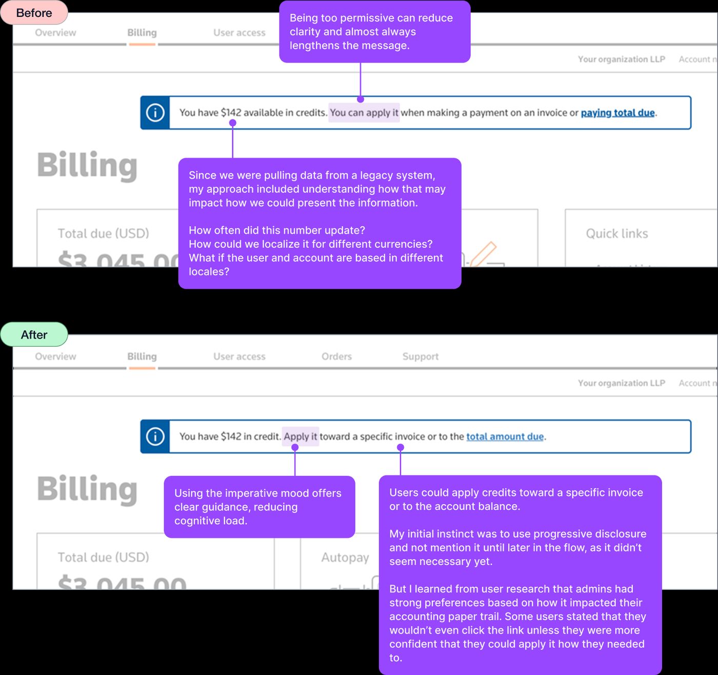
Good beats short
There’s a content design principle that, when it comes to microcopy, “short beats good.” It’s one I generally echo— my first instinct when reviewing a string is to start looking for words to cut.
I could have shortened this banner notification to a single sentence, but left it more precise due to feedback received from cautious account admins.
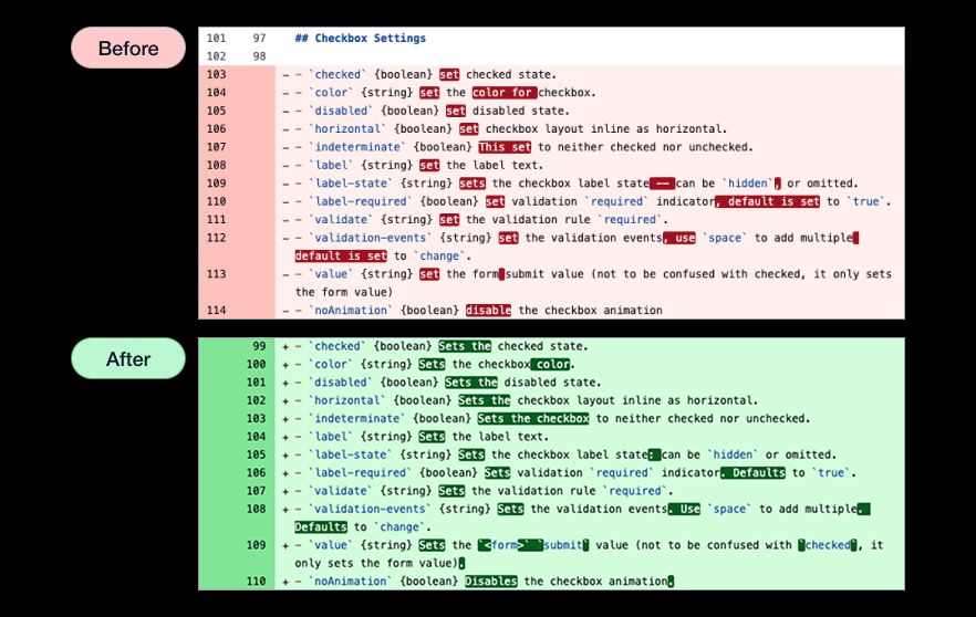
Collaborating in code
Being able to update documentation in the source code boosts efficiency for everyone. It’s quicker for devs to review and approve a PR in GitHub, so I can propose minor updates in the same amount of time it’d normally take to submit the Jira ticket.