Validating UX content
Testing product tone with user research.
Challenge
While working on Westlaw, a market-leading legal research product, I had the opportunity to get customer feedback on what type of tone they expected from the tool.
Like most SaaS products, there was a generic error message that was shown as a fallback when more meaningful information wasn’t available.
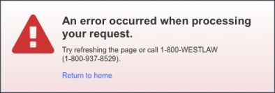
Existing page error.
The product had never had formal support from UX writers, and much of the UX copy written by developers and product managers was very formal, technical, and harder to scan. (Many PMs were former attorneys, who learned to write with precision over all else.)
Some stakeholders were hesitant to using plain language in UX copy, as they felt it may “dumb down” messages to legal experts. Others wanted to explore incorporating a more fun, casual voice that they noticed in their personal consumer apps.
How I helped
Using precise, specialized terms was still critical within product content, but I was confident that even experts would prefer more straightforward UX copy to help them move throughout the product UI.
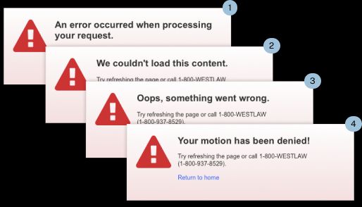
I created 4 versions of the error, using NN/g’s “Four Dimensions of Tone of Voice” framework, and integrated it into a broader Axure prototype that users would be navigating alongside a user researcher. The errors were displayed to different users at random.
To isolate variables, I changed only the heading copy, keeping the rest of the UI and microcopy consistent. My rationale was that I’d gauge their reactions to the more prominent copy and adjust the overall tone to fit whichever performed best.
Outcome
While customers understandably didn’t display a strong preference for any error, version #3 was the one that was most familiar. Several participants mentioned they had recognized similar patterns in other consumer sites.
What stood out was nearly all participants objected very negatively to variant #4. They deemed Your motion has been denied as too playful for a professional legal research tool that warranted high subscription costs. One user mentioned it wouldn’t have bothered them so much if it wasn’t presenting an error.
The adverse reaction confirmed other anecdotal feedback I’d heard from customers in past research sessions.
While we did adjust the wording in the error accordingly, the user reactions were just as valuable in showing stakeholders that the UX copy mattered. It brought more visibility to content design and helped secure more buy-in to test content more in the future.
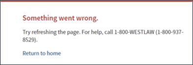
Redesigned error message.
